오늘은 CSS 위치 속성인 position 속성에 대해 정리해볼게요🔍
웹 페이지를 작업할 때 각 요소의 위치는 2가지 방법으로 설정할 수 있는데
태그 요소를 입력한 순서를 통해 상대적으로 위치를 지정하는 상대 위치 좌표와
X좌표와 Y좌표를 직접 설정해 절대 위치를 지정하는 절대 위치 좌표가 있습니다.
상대 위치 좌표와 절대 위치 좌표에 따라 요소를 배치할 수 있는 position 속성에 대해 알아봐요!!🔥🔥

position은 위치를 잡아주는 속성으로
보통 콘텐츠를 서로 겹치게 배열하거나 마크업 순서와 디자인 상의 순서가 다를 경우 사용합니다.
하지만 레이아웃 깨뜨릴 수 있기 때문에 남용해서는 안돼요!🙅🏻
값으로는 static / relative / absolute / fixed / sticky가 있고
top / right / bottom / left 속성과 함께 사용하여 위치를 지정합니다.
요소의 우선 순위를 변경하고자 할 때 z-index 속성을 사용하는데 숫자가 클수록 상위 순서로 변경됩니다.
그리고 기억하고 있어야 할 것은 ⭐️position 속성은 상속되지 않아요!!⭐️
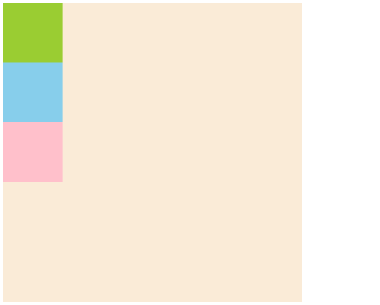
📌 position: static;
기본값으로 position 값을 지정하지 않으면 static 속성이 적용됩니다.
없는거나 마찬가지인 속성값이기 때문에 position이 있다는 기준에서는 빠져요!
위에서 아래로, 왼쪽에서 오른쪽으로 순서에 맞게 배치됩니다.(상대좌표)
또한 top, left 속성이 적용되지 않습니다.
<head>
    <style>
        .big{width:500px; height:500px; background-color:antiquewhite;}
        .sml{width:100px; height:100px; position:static;}
        .sml:nth-child(1){background-color:yellowgreen; top:50px;}
        .sml:nth-child(2){background-color:skyblue; left:100px;}
        .sml:nth-child(3){background-color:pink;}
    </style>
</head>
<body>
    <div class="big">
        <div class="sml"></div>
        <div class="sml"></div>
        <div class="sml"></div>
    </div>
</body>
아래 이미지는 위 코드를 작성했을 때 나타나는 화면입니다.
클래스가 sml인 div 태그에 position: static;을 줬기 때문에
첫번째 박스에 top: 50px;, 두번째 박스에 left: 100px;을 줬지만 이동하지 않은 것을 확인할 수 있습니다.
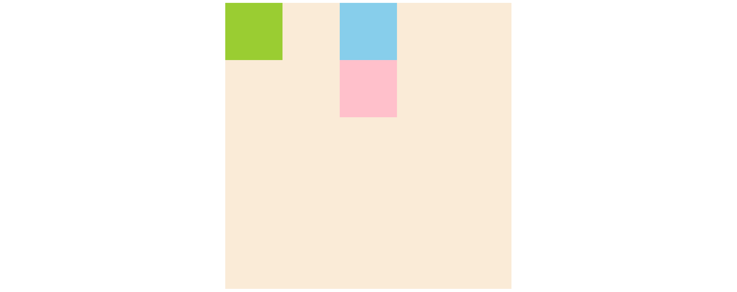
📌 position: relative;
static과 마찬가지로 위에서 아래로, 왼쪽에서 오른쪽으로 순서에 맞게 배치됩니다.(상대좌표)
그러나 static과 달리 top, left 속성이 적용됩니다.
이때 기존의 위치(position이 없을 때의 위치)를 기준으로 이동하는데
이동을 해도 다른 태그의 위치에 영향을 주지 않습니다. 이것은 자신의 기존영역을 지킨다는 것을 의미합니다.
<head>
    <style>
        .big{width:500px; height:500px; background-color:antiquewhite;}
        .sml{width:100px; height:100px; position:relative;}
        .sml:nth-child(1){background-color:yellowgreen; top:50px;}
        .sml:nth-child(2){background-color:skyblue; left:100px;}
        .sml:nth-child(3){background-color:pink;}
    </style>
</head>
<body>
    <div class="big">
        <div class="sml"></div>
        <div class="sml"></div>
        <div class="sml"></div>
    </div>
</body>
아래 이미지는 위 코드를 작성했을 때 나타나는 화면입니다.
클래스가 sml인 div 태그에 position: relative;을 줬기 때문에 position: static;과 달리
첫번째 박스는 top: 50px;만큼, 두번째 박스는 left: 100px;만큼 이동한 것을 확인할 수 있습니다.
그리고 세번째 박스는 위 박스들이 이동한 것에 영향을 받지 않고 원래 자리에 위치하고 있습니다.

+ 추가로 relative는 position: absolute;의 부모요소에 줘서 위치를 컨트롤할 수 있고
position과 함께 써야하는 속성을 써야할 때 사용됩니다.
📌 position: absolute;
절대좌표이고 top, right, bottom, left 속성이 모두 적용됩니다.
그러나 relative와 달리 이동을 했을 때 자신의 영역을 지키지 않기 때문에 하위 태그가 absolute 영역의 원래 위치로 옵니다.
top, right, bottom, left 값이 있을 때는 부모요소의 position 유무에 따라 이동하는 위치의 기준이 달라지는데
부모요소가 position이 있으면 부모요소를 기준으로 이동하고
<head>
    <style>
        div{margin:0 auto;}
        .big{width:500px; height:500px; background-color:antiquewhite;}
        .sml{width:100px; height:100px;}
        .sml:nth-child(1){background-color:yellowgreen;}
        .sml:nth-child(2){background-color:skyblue;}
        .sml:nth-child(3){background-color:pink;}
    </style>
</head>
<body>
    <div class="big" style="position:relative;">
        <div class="sml" style="position:absolute; left:0;"></div>
        <div class="sml"></div>
        <div class="sml"></div>
    </div>
</body>
부모요소가 position이 없으면 브라우저를 기준으로 이동합니다.
<head>
    <style>
        div{margin:0 auto;}
        .big{width:500px; height:500px; background-color:antiquewhite;}
        .sml{width:100px; height:100px;}
        .sml:nth-child(1){background-color:yellowgreen;}
        .sml:nth-child(2){background-color:skyblue;}
        .sml:nth-child(3){background-color:pink;}
    </style>
</head>
<body>
    <div class="big">
        <div class="sml" style="position:absolute; left:0;"></div>
        <div class="sml"></div>
        <div class="sml"></div>
    </div>
</body>

top, right, bottom, left 값이 없을 때는
부모요소가 position이 있던 없던 부모요소의 초기점(왼쪽 상단)으로 이동합니다.
<head>
    <style>
        div{margin:0 auto;}
        .big{width:500px; height:500px; background-color:antiquewhite;}
        .sml{width:100px; height:100px;}
        .sml:nth-child(1){background-color:yellowgreen;}
        .sml:nth-child(2){background-color:skyblue;}
        .sml:nth-child(3){background-color:pink;}
    </style>
</head>
<body>
    <div class="big" style="position:relative;">
        <div class="sml" style="position:absolute;"></div>
        <div class="sml"></div>
        <div class="sml"></div>
    </div>
</body>

+ 보통 fade-in/out 슬라이드나 opacity를 사용한 겹치는 디자인과 같이 형제태그끼리 겹치고 싶을 때 사용합니다.
📌 position: fixed;
absolute처럼 절대좌표이고 top, right, bottom, left 속성이 모두 적용됩니다.
또한 자신의 영역을 지키지 않기 때문에 하위 태그가 fixed 영역의 원래 위치로 옵니다.
top, right, bottom, left 값이 있으면 웹사이트의 초기점을 기준으로 이동합니다.
스크롤 바가 내려갈 만큼 많은 내용이 웹 문서에 포함되어 있어도 항상 고정되어 표시됩니다.(스크롤을 따라다님)
카카오톡 문의하기, 사이드메뉴, 상단에 고정된 헤더, 위로/아래로 가기 버튼, 따라다니는 광고, 위젯 등에 사용됩니다.
<head>
    <style>
        div{margin:0 auto;}
        .big{width:500px; height:1500px; background-color:antiquewhite;}
        .sml{width:100px; height:100px;}
        .sml:nth-child(1){background-color:yellowgreen;}
        .sml:nth-child(2){background-color:skyblue;}
        .sml:nth-child(3){background-color:pink;}
    </style>
</head>
<body>
    <div class="big">
        <div class="sml" style="position:fixed; right:50px; bottom:50px;"></div>
        <div class="sml"></div>
        <div class="sml"></div>
    </div>
</body>

📌 position: sticky;
relative와 fixed의 특징을 다 가지고 있습니다.
처음에는 스크롤을 안 따라다니다가(relative) 조건 충족시에 스크롤을 따라다닙니다(fixed).
그러나 position: sticky만 쓰면 아무런 변화가 일어나지 않고
top, right, bottom, left 중 하나의 값을 필수적으로 지정해야 합니다.⭐️⭐️
예를 들어 top: 0px로 설정한 경우에
sticky 영역의 y 위치값이 설정된 위치에 도달하기 전까지는 relative처럼 스크롤을 안 따라다니다가
설정된 위치에 도달한 이후에는 fixed처럼 스크롤을 따라다닙니다.
글로는 이해하기 힘들 수 있어요:( 아래 파일에서 직접 확인해보세요!
JS를 이용해야만 구현할 수 있던 기능을 CSS만으로도 구현할 수 있게 된 것입니다.
구버전에서는 지원이 안되는 경우 있어요!
지금까지 position 속성에 대해 정리해봤는데
개인적으로는 제일 복잡한 css 속성인 것 같아요!
직접 코드를 입력해보면서 익숙해지면 잘 사용하실 수 있을 거예요:)
안뇽~~👋🏻👋🏻
'css' 카테고리의 다른 글
| [CSS] float 속성 | left | right | none | 해제 (0) | 2022.10.19 |
|---|---|
| [CSS] display 속성 | block | inline | inline-block | none (0) | 2022.10.08 |

